
back in 1986, when I was in my first year of illustration at the Royal College of Art, quentin blake, who was head of illustration, suggested I enter a competition to design the murals.
London Underground had already rejected a couple of design proposals created by big architecture firms for Holborn underground stations and they came to the RCA for a fresh start. their brief was ‘the british museum’. And I learned that actually there is a disused station on the Central Line named ‘Museum’, which you can just glimpse in the darkness if you travel on the Piccadilly Line between Covent Garden and Holborn).
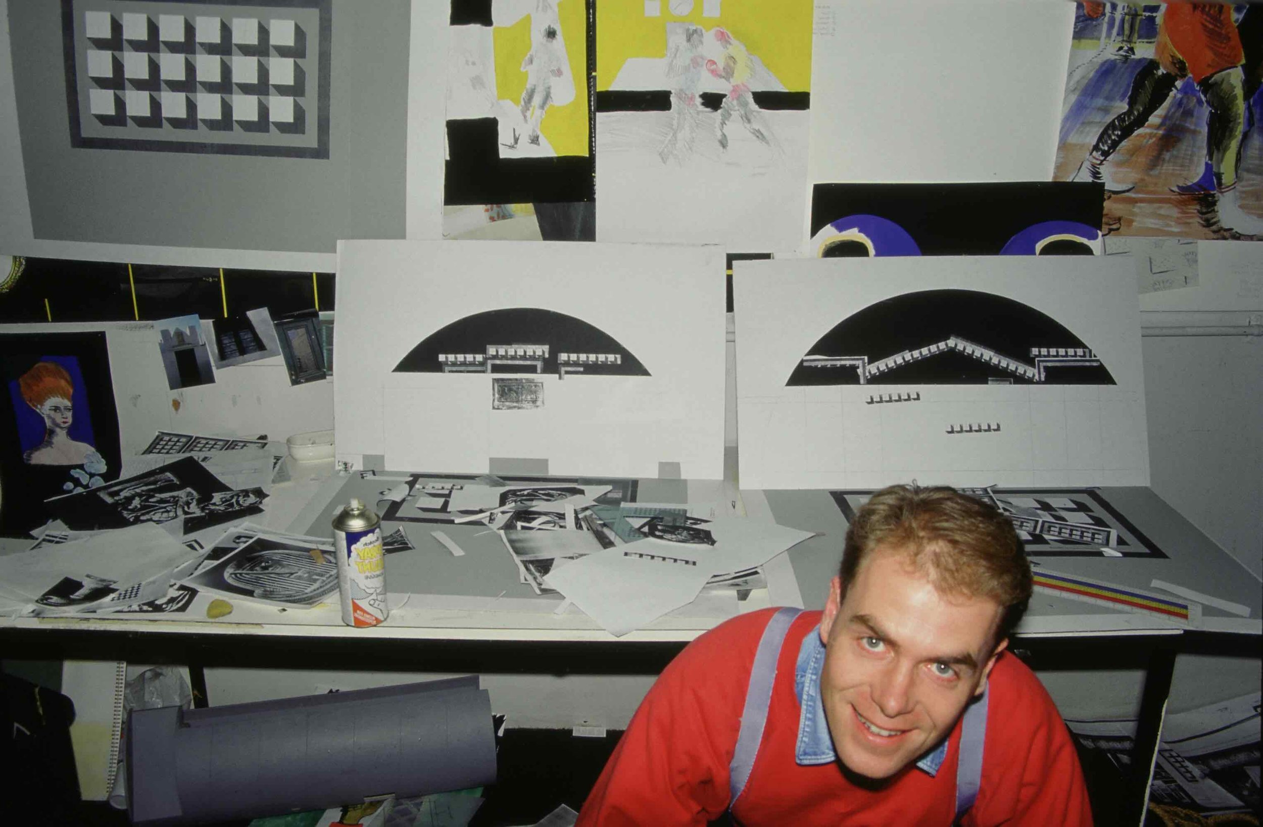
Eduardo Paolozzi was a visiting professor in ceramics at the time and he told me he had created all of his designs for Tottenham Court Road station using photocopies pasted onto cardboard models. he said he’d done a lot of the work at home on his kitchen table using scissors and glue. Such a simple technique! This gave me the courage to work in collage. I photocopied the architects' plans, made some cardboard models like Eduardo's, and set to work.
I had just come back from Greece and Italy, on a Royal Society of Arts Bursary. the trompe-l’oeil effect of some of the murals at Pompeii had fascinated me.
HOLBORN STATION MURALs

Working with The British Museum
i went to the museum, and outside I started sketching the magnificent British Museum portico by smirke, and observed how the fluted columns hide and reveal the windows behind them as you walk by.
Back in the studio at the RCA I made a number of paper trompe l' oiel columns and built a collage of photocopies of archive pictures from the museum, all against a black background.
so My idea began to develop - that when you ride into the station you immediately know where you are because the big columns whizz by. and then When the train comes to a stop you can get off and look closely at the ghostly details in the photographic images of exhibits.
During my research the museum gave me access to its archive of wonderful large glass photo negatives of Egyptian and Roman antiquities. although 100 years old, old, these were super-hi resolution, and I found I could make use of them.

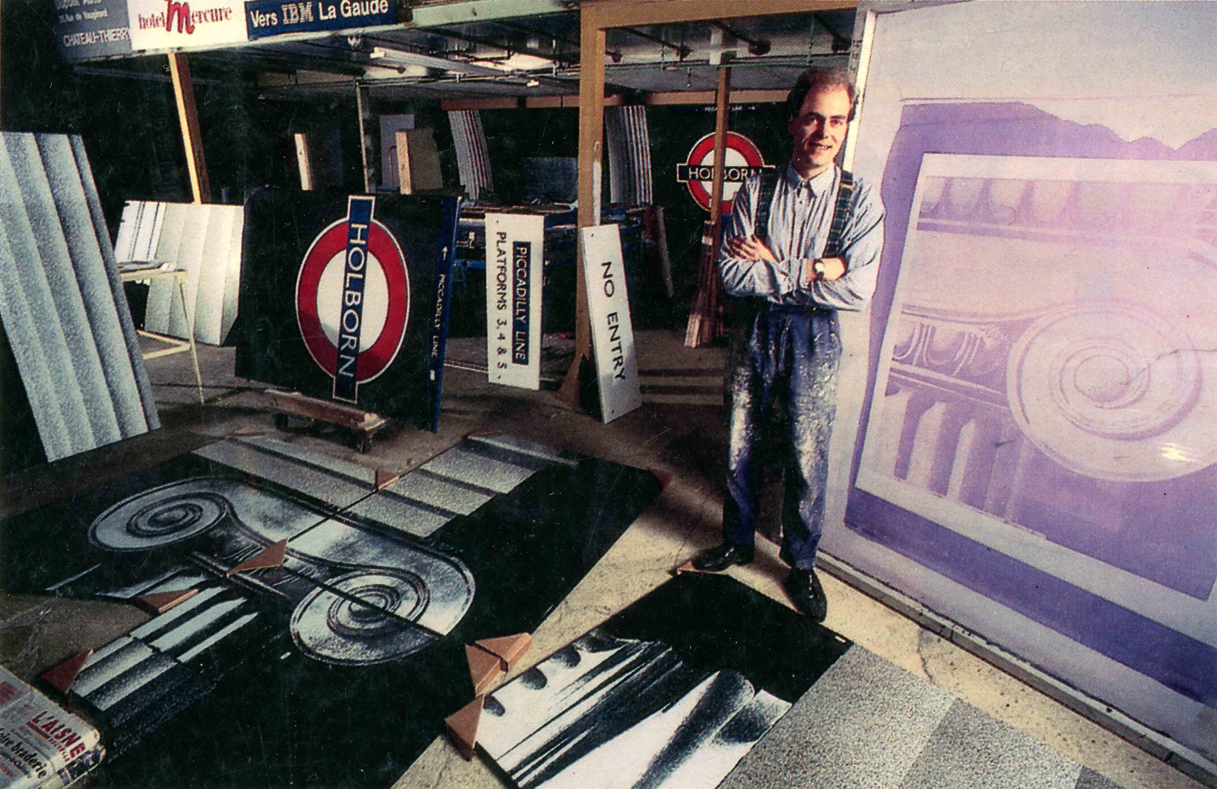
Working in Vitreous Enamel on Steel
Next came the challenge of translating a small paper collage model into full scale images made of enamel on steel. This all happened in france at L'Emaillerie Moderne de L'Aisne, where I made friends with the expert cratsmen there and we sucessfully built a curved silkscreen bed (not something I have ever seen before or since). We even built several curved metal-framed silkscreens. The images were then printed in white enamel paste on a blue-black background, dried, and then I brushed off the unwanted parts of the images before firing in the kiln.
I made the larger trompe l'oiel column images using stencils that I cut myself from plastic, and I used a spray gun filled with enamel solution. It was a giant airbrush experiment. The panels needed several firings, which was another technical challenge. The end result is fantastic. I love enamel on steel. it's a beautiful process and the finish is so durable.
The floors at Holborn are also my design, again inspired by my the ancient mosaic floor patterns in Pompeii. The colour and texture matches the columns
London Underground's flooring contractor had already priced the job by this time, so I had to work out an economic way of getting the terrazzo tiles cut, grouted and polished within budget. The floor designs work with the wall designs and are a memorable part of the experience for people passing through the platforms and passageways.
My biggest challenge was to accommodate all of the posters and signs that might interfere with the overall effect. I wanted to create an infinite dark space behind the objects. the all-black scheme helps calm down all of the visual clutter. it’s the only station where posters do not sit in special borders or fraMES. This took a while to get through the committee. I had to accept a white border around the actual station name and logo, which was a bit of a disappointment. in fact It was always difficult trying to convince London Underground not to go for an all-over beige scheme, which every committee tended towards. I was delighted when my ideas were eventually approved.

Lighting Scheme
30 years on I still love the station. My only wish is that I’d got the lighting scheme I was promised. I wanted travellers to feel they were discovering the objects underground for the first time. so I asked for the kind of atmospheric pelmet lighting that is used in David Gentleman's Charing Cross station design. sadly the bright overhead strip light was chosen.
I had also hoped for spotlights hitting the terrazzo floor. But no such luck, and I'm still hoping. But London Underground were marvellous to let a student loose on mural designs for one of London's biggest subway interchanges.
And as a footnote, when the scheme was nearly finished in 1990, I found myself quite by chance moving our young family in to rent the very house that Eduardo Paolozzi had recently vacated at Landermere Quay in Essex.
And that's where, in Eduardo’s old studio, my children's book career began. the studio is just across the lane from the King’s Head once owned by the brilliant collagist Nigel Henderson (a collaborator with paolozzi) .
so, if you look closely at the way my first book ‘The Willow Pattern Story’ works, you will see that as you turn the pages, the design functions in the same horizontal space as my murals at Holborn. There is a overall big rhythm at the margins, like pulling into a station. And when you turn the pages. And when you look closely there is plenty of detail in the small vignette images.